B2C
Zero → One
Company: Inspire
How I designed a dashboard to encourage upgrading to clean energy
Problem
Communicating clearly: their current energy usage includes some clean sources, but there’s room for improvement—and it’s a worthwhile investment.
Solution
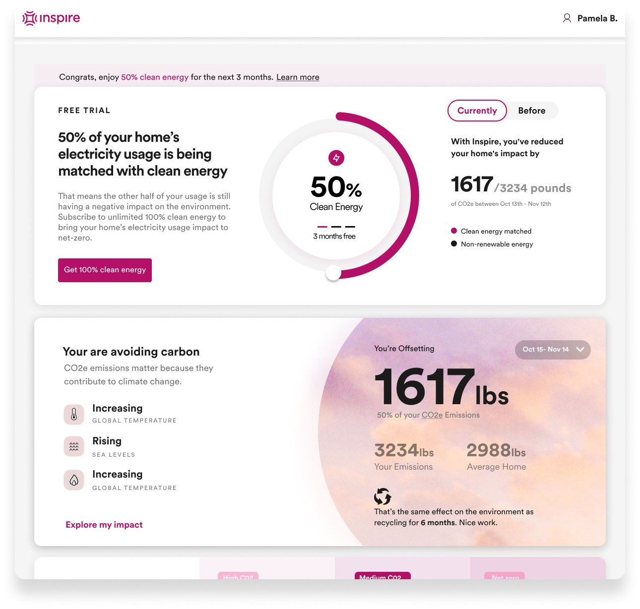
The solution is a dashboard-style landing page, tailored to each user segment, ultimately conveying the message that upgrading can reduce the carbon footprint.

Context
Persuading individuals to invest in clean energy is challenging — it requires telling a compelling story about their current usage, presenting personalized data, and delivering a clear call to action, all in one experience. I was responsible for designing a journey that captivates users and converts them into paying customers.
Challenge
A landing page is needed for free plan users to encourage them to upgrade to a paid plan. While the exact experience is yet to be defined, it’s clear this page will play a key role in the sales funnel and conversion process.
Strategy: Goals & Vision
Business Opportunity
Increase subscriptions
The goal of this project is to increase the number of paid subscribers.
The goal of this project is to increase the number of paid subscribers.
Increase conversions
The business is using the Freemium model to get users invested in the product and to see some of the benefits.
The business is using the Freemium model to get users invested in the product and to see some of the benefits.
Value Proposition
Affordable, flat rate
Say goodbye to unpredictable energy bills and fluctuating prices.
Say goodbye to unpredictable energy bills and fluctuating prices.
Clean energy
100% clean energy, offsetting carbon energy use to have a zero carbon footprint from home energy usage.
100% clean energy, offsetting carbon energy use to have a zero carbon footprint from home energy usage.
User Needs
Based on in-depth research to understand user needs, we uncovered pain points, goals, and opportunities. These insights shaped our design decisions.
- Affordability - Users are not happy with expensive and unpredictable energy bills.
- Help limit their carbon imprint - Users want their energy usage to help, not harm, the environment.
Focus
How might we design an experience that motivates users to switch to a paid subscription for clean energy?
Ideation
Brainstorming
With a cross-functional team, we brainstormed the direction and messaging for the user experience.

Addressing user needs
Based on the user needs identified in our research, we crafted a user experience per each one: affordability, environmental impact, and earning their trust.

Prioritizing key features
We identified numerous features to address the needs uncovered in discovery. Prioritizing and selecting the elements with the greatest impact on conversion was essential.

Defining structure & hierarchy
Based on the user needs identified in our research, we crafted a user experience per each one: affordability, environmental impact, and earning their trust.

User Testing
We conducted a series of internal usability tests, engaging subject matter experts, product stakeholders, and cross-functional team members to evaluate the effectiveness of the page. Their feedback provided valuable insights into usability, clarity, and alignment with user needs—affirming what was working well and revealing opportunities for further refinement.
First Iteration
Pro
This first iteration includes all the elements I identified in discovery.
Con
It lacks a coherent story and feels scattered, ultimately falling short of our goal.

Second Iteration
Pros
This version gets it right by telling a linear story.
Cons
The UX involves a few too many steps to provide a complete picture, making the experience still somewhat overwhelming.

Third (Final) Iteration
Pros
* Contains all elements to address user needs, without anything unnecessary
* Tells a linear story, without overwhelming
* Effectively communicates the value proposition
* Tells a linear story, without overwhelming
* Effectively communicates the value proposition

Launch
We landed on a dashboard landing page with a linear storytelling approach, testing if it will effectively convey the essential elements to drive user conversions.
Takeaways
Prioritization strategy
Although there's much we want to communicate, it's essential to prioritize key elements. Often, less is more—it's about focusing on key points to meet both user and business goals.
Embracing ambiguity
Good design can emerge from ambiguous requirements, by aligning design decisions to the business and user needs.
Storytelling
This project highlights the power of storytelling in user experience, demonstrating that a good user experience does more than just place elements on the screen.
The power of UI
Using UI elements and well-executed UX can help in the storytelling and the user’s understanding to encourage them to take the desired action.
Next Steps
Qualitative & Quantitative Analyses
With continuous discovery, I would interview users to see if they understand the value proposition, and if the landing page is meeting their needs. I would also monitor various metrics to assess the effectiveness of the landing page funnel page.
Experimentation
I would keep iterating, refining the user experience based on ongoing insights and outcomes.

